10. Correlation analysis
Module items
R Script file code
-
[[Copy the code]] below ➜ Paste into [[RStudio console]] ➜ Hit Enter.
-
source(url("https://raw.githubusercontent.com/ttezcann/ssric-reg/refs/heads/main/docs/assets/r-scripts/0-packages-data.R")); (function(f="10-correlation.R"){if(!file.exists(f)){download.file("https://raw.githubusercontent.com/ttezcann/ssric-reg/refs/heads/main/docs/assets/r-scripts/10-correlation.R",f,mode="wb");file.edit(f)}else{download.file("https://raw.githubusercontent.com/ttezcann/ssric-reg/refs/heads/main/docs/assets/r-scripts/10-correlation.R",gsub(".R","-original.R",f),mode="wb");file.edit(gsub(".R","-original.R",f))}})()- When this R script file opens in a new tab, [[Save R script file|save your previous R script file(s)]], and
- Close the previous tabs (R Script files), which you can find later in the [[Files tab]].
- When this R script file opens in a new tab, [[Save R script file|save your previous R script file(s)]], and
-
Lab assignment
Sample lab assignment
Suggested reading
Weinstein, Jay A. 2010. “Correlation Description and Induction in Comparative Sociology.” Pp. 297–324 in Applying social statistics: An introduction to quantitative reasoning in sociology. Lanham: Rowman & Littlefield.
Learning outcomes
- Learn the basic terms and concepts related to the correlation analysis
- Define the purpose of bivariate and multivariate correlation analysis
- Learn how to generate:
- Bivariate correlation analysis (two variables):
- Correlation table
- Scatterplot graph
- Multivariate correlation analysis (more than two variables)
- Correlation table matrix
- Scatterplot graph matrix
- Bivariate correlation analysis (two variables):
- Learn how to interpret p-value to determine whether a correlation is statistically significant
- Learn how to interpret r-value to determine the direction and strength of a relationship between two continuous variables
[[Correlation analysis]] specifics
- Correlation analysis:
- Examines the relationship between continuous variables.
- Correlation is not causation: it does not show a causal relationship.
- Correlation yields two values:
- [[p-value]], showing the significance of the relationship, and
- [[r-value]], showing the strength and direction of the relationship.
- r-value (correlation coefficient) is between minus one and plus one (-1 and +1).
[[Significance of correlation]] (with [[p-value]])
- Using the p-value, we determine if the correlation is:
- [[Nonsignificant correlation]]: When the p-value is greater than 0.05 (p > 0.05), it's a nonsignificant correlation. This means that there's no meaningful relationship between two continuous variables; such as height and education.
- [[Significant correlation]]: When the p-value is than 0.05 (p < 0.05), it's a significant correlation. This means that there's a meaningful relationship between two continuous variables; such as height and weight.
- If we have a significant correlation, we continue with checking the r-value to see the direction and strength of correlation.
- [[Nonsignificant correlation]]: When the p-value is greater than 0.05 (p > 0.05), it's a nonsignificant correlation. This means that there's no meaningful relationship between two continuous variables; such as height and education.

[[Direction of correlation]] (with [[r-value]])
- Using r-value, we determine the direction of correlation. If the p-value is less than 0.05 (p < 0.05); and
- If the r-value is positive (such as
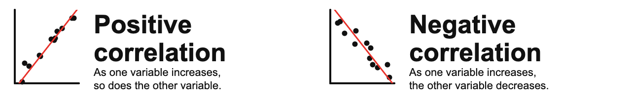
r=0.250), then, there's a:- [[Positive correlation]]: As one variable increases, so does the other variable.
- If the r-value is negative (such as
r= - 0.250), then, there's a:- [[Negative correlation]]: As one variable increases, the other variable decreases.
- [[Negative correlation]]: As one variable increases, the other variable decreases.
- If the r-value is positive (such as
[[Strength of correlation]] (with [[r-value]])
-
Using r-value, we determine the strength of correlation.
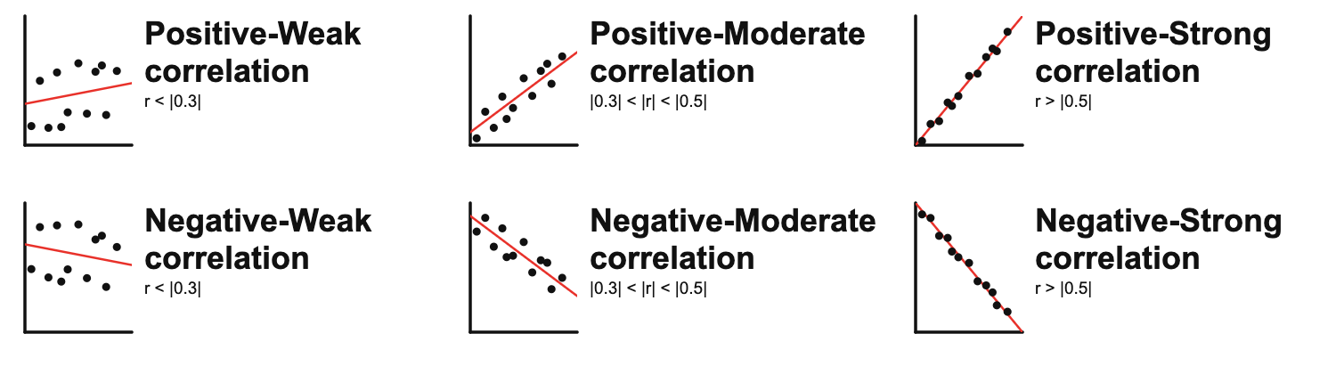
- r-value = less than |0.3| ➜ [[weak correlation]]
- r-value = higher than |0.3| and less than |0.5| ➜ [[moderate correlation]]
-
r-value = greater than |0.5| ➜ [[strong correlation]]
-
The r-value is an absolute number. That means;
- r= -.673 is stronger than r= .567 (negative .637 r-value is stronger than positive .567 r-value)
- r= -.432 is stronger than r= .322 (negative .432 r-value is stronger than positive .322 r-value)
- r= .567 is stronger than r= -.322 (negative .567 r-value is stronger than negative -.322 r-value)
Guessing correlation type exercise
-
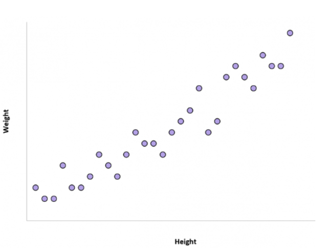
1. Height and weight
-
Is there a correlation between height and weight? If yes, positive or negative?
-
Show the answer
- The correlation between the height of an individual and their weight tends to be positive.
- In other words, individuals who are taller also tend to weigh more.
-
-
-
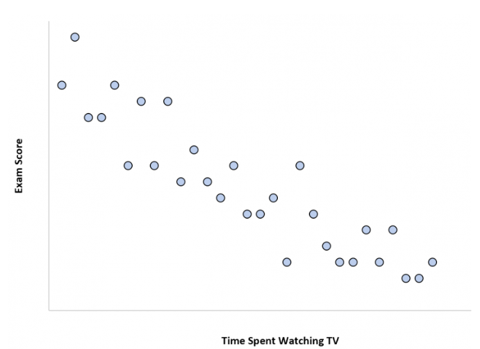
2. Time spent watching TV and exam scores
-
Is there a correlation between time spent watching TV and exam scores? If yes, positive or negative?
-
Show the answer
- The more time a student spends watching TV, the lower their exam scores tend to be.
- Time spent watching TV and the variable exam score have a negative correlation. As time spent watching TV increases, exam scores decrease.
-
-
-
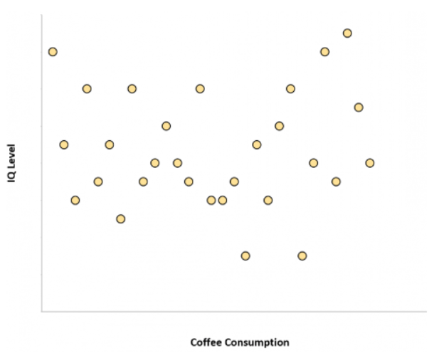
3. Coffee consumption and intelligence
-
Is there a correlation between coffee consumption and intelligence? If yes, positive or negative?
-
Show the answer
- The amount of coffee that individuals consume and their IQ level are unrelated.
- In other words, knowing how much coffee an individual drinks doesn’t give us an idea of what their IQ level might be.
-
-
-
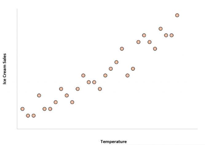
4. Temperature and ice cream sales
-
Is there a correlation between temperature and ice cream sales? If yes, positive or negative?
-
Show the answer
- The correlation between the temperature and total ice cream sales is positive.
- In other words, when it’s hotter outside the total ice cream sales of companies tends to be higher since more people buy ice cream when it’s hot out.
-
-
-
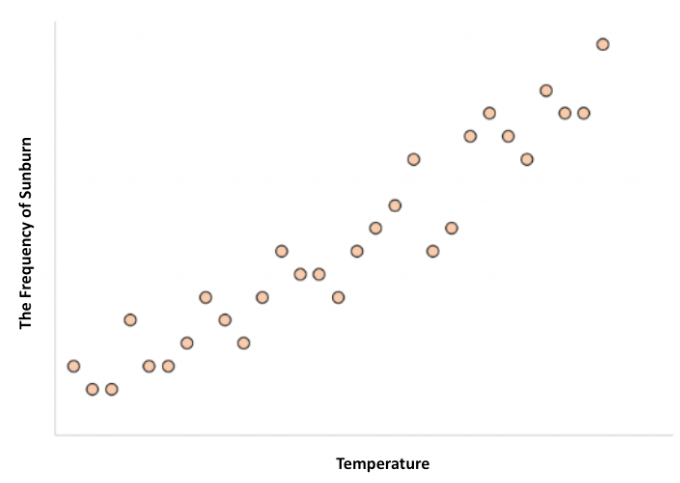
5. temperature and frequency of sunburn
-
Is there a correlation between temperature and frequency of sunburn? If yes, positive or negative?
-
Show the answer
- The correlation between the temperature and the frequency of sunburn is positive.
- In other words, when it’s hotter outside the frequency of sunburn is more likely.
-
-
-
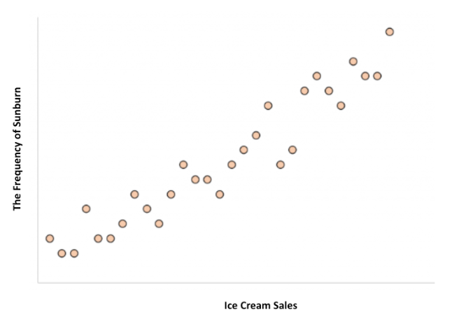
6. frequency of sunburn and ice cream sales
-
Is there a correlation between the frequency of sunburn and ice cream sales? If yes, positive or negative?
-
Show the answer
- The correlation between the frequency of sunburn and total ice cream sales is positive.
- HOWEVER, ice cream consumption does not cause sunburns or getting a sunburn doesn’t make someone eat more ice cream.
- Both of these variables, ice cream consumption and sunburn frequency, are higher when it’s hotter outside.
-
-
[[Confounding variable]]
- A third variable, "temperature", that affects both variables, "frequency of sunburn" and "ice cream sales".
- If one is not careful, it can make it appear that there is a correlation between two variables that are actually both independently being influenced by this third variable, "temperature".
- Other confounding variable examples:
- Number of schools in a city and number of crimes in a city
- Confounding Variable: City population
- Shoe size and reading ability in children
- Confounding Variable: Age of the child
- Outdoor exercise frequency and vitamin D levels
- Confounding Variable: Sunlight exposure
- Number of schools in a city and number of crimes in a city
- If one is not careful, it can make it appear that there is a correlation between two variables that are actually both independently being influenced by this third variable, "temperature".

[[Bivariate correlation]]
- Shows the relationship between two continuous variables in a table-graph format:
- [[Correlation table]] shows this relationship in a table format:
- Reports the correlation coefficient (r-value) and statistical significance (p-value).
- [[Scatterplot graph]] shows this relationship in a graph format:
- In addition to the r-value and p-value, displays the shape of the relationship.
- [[Correlation table]] shows this relationship in a table format:
GSS Example 1: Significant and negative correlation
The relationship between educ and tvhours
- We may wonder if there's a correlation between the respondents' education in years (
educ) and television screen time in hours (tvhours).-
Here we do not propose any kind of cause-and-effect.
-
flowchart LR
subgraph F["Continuous variable"]
    A[Respondents' education in years]
end

subgraph O["Continuous variable"]
    B[Television screen time in hours]
end

A <==>|May have a relationship| B
-
-
Find the variables in Variables in GSS page
- We want to make sure that
educandtvhoursare continuous variables. -
[[Search]] these variable names in Variables in GSS page.
-
Variable name Variable label Variable type Question wording and response categories educRespondents' education in years Continuous What is the highest year of school you completed?
(Min: 0, Max: 20)tvhoursTelevision screen time in hours Continuous On the average day, how many hours do you personally watch television?
(Min: 0, Max: 24)
-
[[Correlation table]] #code
-
[[Model code]]
-
[[Working code]]
-
- Line 1: We put
educhere ➜variable1_hereandtvhourshere ➜variable2_here.- The order of the variables doesn't matter.
- Make sure there's no space after the variable name, such as "educ ".
- [[Find this working code in the R script file]].
- [[Highlighting and running]] this code will generate the output below (which will appear in the [[viewer tab]] of RStudio).
- Line 1: We put
-
[[Correlation table]] #output
-
Respondents' education in years Television screen time in hours Respondents' education in years Television screen time in hours r = -0.163
p = <0.001***
[[Scatterplot graph]] #code
-
[[Model code]]
-
-
[[Working code]]
-
- Line 1: We put
educhere ➜variable1_hereandtvhourshere ➜variable2_here.- The order of the variables doesn't matter.
- Make sure there's no space after the variable name, such as "tvhours ".
- [[Find this working code in the R script file]].
- [[Highlighting and running]] this code will generate the output below (which will appear in the [[plots tab]] of RStudio).
- Line 1: We put
-
[[Scatterplot graph]] #output
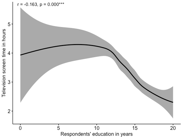
[[Correlation table]] and [[scatterplot graph]] #interpretation
-
Significant (p < 0.05) and weak (r < |0.3|) correlation interpretation sample
There is a significant correlation between respondents' education in years and television screen time in hours since the p-value is less than .05.
This correlation is negative and weak since the r-value is -0.163 (less than |0.3|).
This means that as respondents' education in years increases television screen time in hours decreases, and vice versa.
-
Significant (p < 0.05) and weak (r < |0.3|) correlation interpretation template
There is a significant correlation between [[variable label]] 1 and variable label 2 since the p-value is less than .05.
This correlation is negative and weak since the r-value is -0.xxx (less than |0.3|).
OR This correlation is negative and moderate since the r-value is -0.xxx (between |0.3| and |0.5|).
OR This correlation is negative and strong since the r-value is -0.xxx (higher than |0.5|).
This means that as [[variable label]] 1 increases [[variable label]] 2 decreases, and vice versa.
-
Interpretation explanation
- We first check the [[p-value]].
- If it's greater than 0.05, it's a nonsignificant correlation and we do not interpret the r-value. If it's less than 0.05, it's a significant correlation.
- This analysis yields a [[significant correlation]] since the p-value < 0.05.
- If it's greater than 0.05, it's a nonsignificant correlation and we do not interpret the r-value. If it's less than 0.05, it's a significant correlation.
- If it's a significant correlation, then we check the [[r-value]].
- Check the direction of the correlation: if there's a minus (-), it's a negative correlation; if there's no minus, it's a positive correlation.
- This analysis yields a [[negative correlation]],
-0.163.
- This analysis yields a [[negative correlation]],
- Check the strength of the correlation.
-0.163is less than |0.3|, so this is a [[weak correlation]].- Remember, r-values are absolute numbers. It wouldn't matter if it is
-0.163or0.163, it's still weak correlation.
- Remember, r-values are absolute numbers. It wouldn't matter if it is
- Check the direction of the correlation: if there's a minus (-), it's a negative correlation; if there's no minus, it's a positive correlation.
- We first check the [[p-value]].
GSS Example 2: Significant and positive correlation
The relationship between masei10 and pasei10
- We may wonder if there's a correlation between the respondents' mothers' socio-economic index score (
masei10) and fathers' socio-economic index score (pasei10).-
Here we do not propose any kind of cause-and-effect.
-
flowchart LR
subgraph F["Continuous variable"]
    A[Mothers' SES]
end

subgraph O["Continuous variable"]
    B[Fathers' SES]
end

A <==>|May have a relationship| B
-
-
Find the variables in Variables in GSS page
- We want to make sure that
masei10andpasei10are continuous variables. -
[[Search]] the variable names,
masei10andpasei10, in Variables in GSS page.-
Variable name Variable label Variable type Question wording and response categories masei10Respondents' mothers' socio-economic index score Continuous Respondent's mother's socio-economic index score (calculated)
(Min: 9, Max: 92.8)pasei10Respondents' fathers' socio-economic index score Continuous Respondent's father's socio-economic index score (calculated)
(Min: 9, Max: 93.7)
-
[[Correlation table]] #code
-
[[Model code]]
-
[[Working code]]
-
- Line 1: We put
masei10here ➜variable1_hereandpasei10here ➜variable2_here.- The order of the variables doesn't matter.
- [[Find this working code in the R script file]].
- [[Highlighting and running]] this code will generate the output below (which will appear in the [[plots tab]] of RStudio).
- Line 1: We put
-
[[Correlation table]] #output
-
Respondents' mothers' socio-economic index score Respondents' fathers' socio-economic index score Respondents' mothers' socio-economic index score Respondents' fathers' socio-economic index score r = 0.364
p = 0.001***
[[Scatterplot graph]] #code
-
[[Model code]]
-
-
[[Working code]]
-
- Line 1: We put
masei10here ➜variable1_hereandpasei10here ➜variable2_here.- The order of the variables doesn't matter.
- [[Find this working code in the R script file]].
- [[Highlighting and running]] this code will generate the output below (which will appear in the [[plots tab]] of RStudio).
- Line 1: We put
-
[[Scatterplot graph]] #output
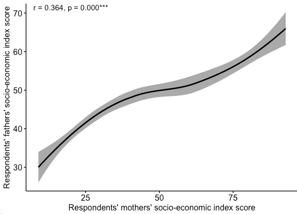
[[Correlation table]] and [[scatterplot graph]] #interpretation
-
Significant (p < 0.05) and moderate (|0.3| < | r | < |0.5|) correlation interpretation sample
There is a significant correlation between respondents' mothers' socio-economic index score and respondents' mothers' socio-economic index score since the p-value is less than .05.
This correlation is positive and moderate since the r-value is 0.364 (|0.3| < | r | < |0.5|).
This means that respondents' mothers' socio-economic index score and respondents' mothers' socio-economic index score increase and decrease together.
-
Significant (p < 0.05) and moderate (|0.3| < | r | < |0.5|) correlation interpretation template
There is a significant correlation between [[variable label]] 1 and variable label 2 since the p-value is less than 0.05.
This correlation is positive and moderate since the r-value is 0.xxx (|0.3| < | r | < |0.5|).
OR This correlation is positive and weak since the r-value is -0.xxx (less than |0.3|).
OR This correlation is positive and strong since the r-value is -0.xxx (higher than |0.5|).
This means that variable label 1 and variable label 2 increase and decrease together.
-
Interpretation explanation
- We first check the [[p-value]].
- If it's greater than 0.05, it's a nonsignificant correlation and we do not interpret the r-value. If it's less than 0.05, it's a significant correlation.
- This analysis yields a [[significant correlation]] since the p-value < 0.05.
- If it's greater than 0.05, it's a nonsignificant correlation and we do not interpret the r-value. If it's less than 0.05, it's a significant correlation.
- If it's a significant correlation, then we check the [[r-value]].
- Check the direction of the correlation: if there's a minus (-), it's a negative correlation; if there's no minus, it's a positive correlation.
- This analysis yields a [[positive correlation]],
0.364.
- This analysis yields a [[positive correlation]],
- Check the strength of the correlation.
0.364is between |0.3| and |0.5|, so this is a [[moderate correlation]].- Remember, r-values are absolute numbers. It wouldn't matter if it is
0.364or-0.3643, it's still moderate correlation.
- Remember, r-values are absolute numbers. It wouldn't matter if it is
- Check the direction of the correlation: if there's a minus (-), it's a negative correlation; if there's no minus, it's a positive correlation.
- We first check the [[p-value]].
Example 3: Nonsignificant correlation
The relationship between hrs1 and sibs
- We may wonder if there's a correlation between the number of hours respondents worked last week (
hrs1) and the number of brothers and sisters respondents have (sibs).-
Here we do not propose any kind of cause-and-effect.
-
flowchart LR
subgraph F["Continuous variable"]
    A[Hours worked last week]
end

subgraph O["Continuous variable"]
    B[# of brothers and sisters]
end

A <==>|May have a relationship| B
-
-
Find the variables in Variables in GSS page
- We want to make sure that
hrs1andsibsare continuous variables. -
[[Search]] the variable names,
hrs1andsibs, in Variables in GSS page.-
Variable name Variable label Variable type Question wording and response categories hrs1Number of hours respondents worked last week Continuous How many hours did you work last week, at all jobs? sibsNumber of brothers and sisters respondents have Continuous How many brothers and sisters do you have?
-
[[Correlation table]] #code
-
[[Model code]]
-
[[Working code]]
-
- Line 1: We put
hrs1here ➜variable1_hereandsibshere ➜variable2_here.- The order of the variables doesn't matter.
- Make sure there's no space after the variable name, such as "sibs ".
- Highlighting and running this code will generate the output below.
- Line 1: We put
-
[[Correlation table]] #output
-
Number of hours respondents worked last week Number of brothers and sisters respondents have Number of hours respondents worked last week Number of brothers and sisters respondents have r = -0.039
p = 0.068
[[Scatterplot graph]] #code
-
[[Model code]]
-
-
[[Working code]]
-
-
Line 1: We put
hrs1here ➜variable1_hereandsibshere ➜variable2_here.- The order of the variables doesn't matter.
- [[Find this working code in the R script file]].
- [[Highlighting and running]] this code will generate the output below (which will appear in the [[plots tab]] of RStudio).
-
[[Scatterplot graph]] #output
[[Correlation table]] and [[scatterplot graph]] #interpretation
-
Nonsignificant correlation interpretation sample
There is a no significant correlation between the number of hours respondents worked last week and the number of brothers and sisters respondents have since the p-value is greater than .05.
This means that the number of hours respondents worked last week and the number of brothers and sisters respondents have are not related.
-
Nonsignificant correlation interpretation template
There is a no significant correlation between [[variable label]] 1 and variable label 2 since the p-value is greater than .05.
This means that variable label 1 and variable label 2 are not related.
-
Interpretation explanation
- We first check the [[p-value]]. If it's greater than 0.05, it's a nonsignificant correlation and we do not interpret the [[r-value]].
- This analysis yields a [[nonsignificant correlation]] since the p-value > 0.05.
- We first check the [[p-value]]. If it's greater than 0.05, it's a nonsignificant correlation and we do not interpret the [[r-value]].
[[Multivariate correlation]]
- Shows the relationships among multiple (more than two) continuous variables in a table-graph format.
- [[Correlation table matrix]] shows these relationships in a table format:
- Reports the correlation coefficients (r-value) and statistical significance (p-value).
- [[Scatterplot graph matrix]] shows these relationships in a graph format:
- In addition to the r-value and p-value, displays the shape of the relationship.
- [[Correlation table matrix]] shows these relationships in a table format:
GSS Example 1: Correlation table matrix
Find the variables in Variables in GSS page
-
We'll use all the variables we have used so far in the previous sections.
-
Variable name Variable label Variable type Question wording and response categories educRespondents' education in years Continuous What is the highest year of school you completed? tvhoursTelevision screen time in hours Continuous On the average day, how many hours do you personally watch television? masei10Respondents' mothers' socio-economic index score Continuous Respondent's mother's socio-economic index score (calculated)
(Min: 0; Max: 100)pasei10Respondents' fathers' socio-economic index score Continuous Respondent's father's socio-economic index score (calculated)
(Min: 0; Max: 100)hrs1Number of hours respondents worked last week Continuous How many hours did you work last week, at all jobs? sibsNumber of brothers and sisters respondents have Continuous How many brothers and sisters do you have?
-
[[Correlation table matrix]] #code
-
[[Model code]]
-
[[Working code]]
-
Line 1: We put the previous variables here ➜
variable1_hereandvariable2_hereand so on.- [[Find this working code in the R script file]].
- [[Highlighting and running]] this code will generate the output below (which will appear in the [[viewer tab]] of RStudio).
- [[Find this working code in the R script file]].
[[Correlation table matrix]] #output
-
Respondents' education TV screen time Mothers' SES Fathers' SES Hours worked last week Number of siblings Respondents' education TV screen time r = -0.163
p = 0.001***Mothers' SES r = 0.287
p = 0.001***r = -0.125
p = 0.001***Fathers' SES r = 0.353
p = 0.001***r = -0.123
p = 0.001***r = 0.364
p = 0.001***Hours worked last week r = 0.026
p = 0.226r = -0.029
p = 0.265r = 0.034
p = 0.170r = -0.024
p = 0.338Number of siblings r = -0.208
p = 0.001***r = 0.104
p = 0.001***r = -0.221
p = 0.001***r = -0.187
p = 0.001***r = -0.039
p = 0.068
[[Scatterplot graph matrix]] #code
-
[[Model code]]
-
[[Working code]]
-
- Line 1: We put the previous variables here ➜
variable1_hereandvariable2_hereand so on. - [[Find this working code in the R script file]].
- [[Highlighting and running]] this code will generate the output below (which will appear in the [[plots tab]] of RStudio).
- Line 1: We put the previous variables here ➜
-
[[Scatterplot graph matrix]] #output
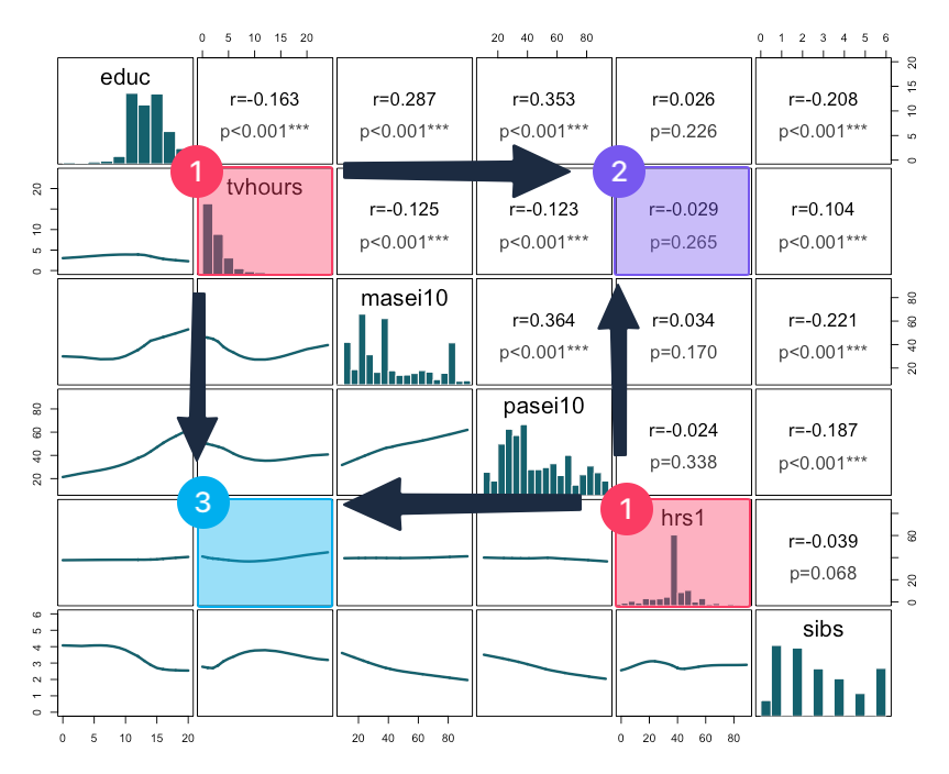
- Start with the diagonal:
- Find your two variables of interest: here, for example,
tvhoursandeduc. - The diagonal cells (in red) show each variable's distribution as a histogram.
- Find your two variables of interest: here, for example,
- Look upper-right:
- The upper-right cell (in purple) at the intersection of your two variables reports the correlation coefficient (r-value) and statistical significance (p-value). Here, r=-0.029, p=0.265.
- Look lower-left:
- The lower-left cell (in blue) at the same intersection shows the scatterplot.
[[Correlation table matrix]] and [[scatterplot graph matrix]] #interpretation
-
Nonsignificant correlation interpretation sample
There is a no significant correlation between the television screen time in hours and the number of hours respondents worked last week since the p-value is greater than .05.
This means that the television screen time in hours and the number of hours respondents worked last week are not related.
-
Nonsignificant correlation interpretation template
There is a no significant correlation between [[variable label]] 1 and variable label 2 since the p-value is greater than .05.
This means that variable label 1 and variable label 2 are not related.
-
Interpretation explanation
- We first check the [[p-value]]. If it's greater than 0.05, it's a nonsignificant correlation and we do not interpret the [[r-value]].
- This analysis yields a [[nonsignificant correlation]] since the p-value > 0.05.
- We first check the [[p-value]]. If it's greater than 0.05, it's a nonsignificant correlation and we do not interpret the [[r-value]].