09. Visualization
Module items
R Script file code
-
[[Copy the code]] below ➜ Paste into [[RStudio console]] ➜ Hit Enter.
-
source(url("https://raw.githubusercontent.com/ttezcann/ssric-reg/refs/heads/main/docs/assets/r-scripts/0-packages-data.R")); (function(f="09-visualization.R"){if(!file.exists(f)){download.file("https://raw.githubusercontent.com/ttezcann/ssric-reg/refs/heads/main/docs/assets/r-scripts/09-visualization.R",f,mode="wb");file.edit(f)}else{download.file("https://raw.githubusercontent.com/ttezcann/ssric-reg/refs/heads/main/docs/assets/r-scripts/09-visualization.R",gsub(".R","-original.R",f),mode="wb");file.edit(gsub(".R","-original.R",f))}})()- When this R script file opens in a new tab, [[Save R script file|save your previous R script file(s)]], and
- Close the previous tabs (R Script files), which you can find later in the [[Files tab]].
- When this R script file opens in a new tab, [[Save R script file|save your previous R script file(s)]], and
-
Lab assignment
Sample lab assignment
Suggested reading
Healy, Kieran Joseph. 2019. “Look at the Data.” Pp. 1–23 in Data visualization: A practical introduction. Princeton: Princeton University Press.
Learning outcomes
- Learn how to generate and interpret a stacked bar graph for multiple categorical variables
- Learn how to generate and interpret a stacked bar graph by groups
- Learn how to customize graph appearance by modifying color themes, titles, and font sizes
[[Stacked bar graph for multiple variables]]
- A stacked bar graph for multiple variables displays:
- Multiple [[categorical]] variables with the exact same response categories at the same time.
- Each row represents one variable and shows the percentage breakdown across response categories.
- It is useful when you want to compare distributions across several related variables.
- When interpreting stacked bar graphs, we generally interpret one response category.
- Multiple [[categorical]] variables with the exact same response categories at the same time.
- We will create a stacked bar graph for confidence in major US institutions variables, then interpret it.
Find the variables in Variables in GSS page
- We want to make sure all selected variables are categorical.
-
[[Search]] the variable names,
conbus,coneduc,confed,conmedic,conarmy, andconjudgein Variables in GSS page.-
Variable name Variable label Variable type Question wording and response categories conbusConfidence level in major companies Ordinal Would you say you have confidence in major companies?
(1: A great deal; 2: Only some; 3: Hardly any)coneducConfidence level in education Ordinal Would you say you have confidence in education?
(1: A great deal; 2: Only some; 3: Hardly any)confedConfidence level in executive branch of fed. govt. Ordinal Would you say you have confidence in executive branch of the federal government?
(1: A great deal; 2: Only some; 3: Hardly any)conmedicConfidence level in medicine Ordinal Would you say you have confidence in medicine?
(1: A great deal; 2: Only some; 3: Hardly any)conarmyConfidence level in military Ordinal Would you say you have confidence in military?
(1: A great deal; 2: Only some; 3: Hardly any)conjudgeConfidence level in United States Supreme Court Ordinal Would you say you have confidence in Supreme Court?
(1: A great deal; 2: Only some; 3: Hardly any)
-
[[Stacked bar graph for multiple variables]] #code
-
[[Model code]]
-
-
[[Working code]]
-
- Line 2: We put the variable names here ➜
variable1_here, variable2_here, variable3_here, separated by a comma.conbus,coneduc,confed,conmedic,conarmy,conjudge.
- Line 4: We put the graph title here ➜
title_here➜Confidence in major US institutions. - Line 6: Change font size of x-axis labels ➜ size=
11 - Line 7: Change font size of y-axis labels ➜ size=
11 - Line 8: Change font size of graph title ➜ size=
12 - Line 9: Change font size of legend ➜ size=
11- [[Find this working code in the R script file]].
- [[Highlighting and running]] this code will generate the output below (which will appear in the [[plots tab]] of RStudio).
- [[Find this working code in the R script file]].
- Line 2: We put the variable names here ➜
-
[[Stacked bar graph for multiple variables]] #output
[[Stacked bar graph for multiple variables]] #interpretation
-
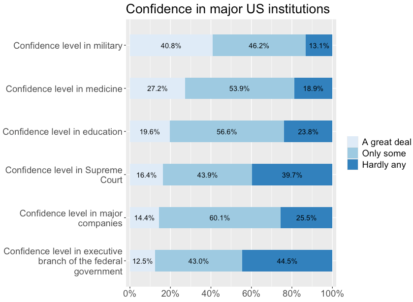
Stacked bar graph for multiple variables interpretation sample
Of the GSS respondents, 40.8% have a great deal of confidence in the military; 27.2% have a great deal of confidence in medicine; 19.6% in education; 16.4% in the supreme court; 14.4% in major companies; and 12.5% in the executive branch of government.
-
Stacked bar graph for multiple variables interpretation template
Of the GSS respondents, xx.xx% have / report / say [[value label]] in [[variable label]] 1; xx.xx% have / report / say value label in variable label 2; xx.xx% have / report / say value label in variable label 3...
-
Interpretation explanation
- When interpreting stacked bar graphs, we pick one response category, use the percentage shown on the graph, and compare it across all variables.
- In this example, we interpret the "a great deal" category (light blue).
- Then, we report the percentage for the same response category in each variable by tweaking wording to make it understandable. That's why we always read the [[question wording]] first.
- For example: "40.8% have a great deal of confidence in the military..."
- When interpreting stacked bar graphs, we pick one response category, use the percentage shown on the graph, and compare it across all variables.
[[Stacked bar graph by groups]]
- We can create a stacked bar graph by groups to:
- Compare a [[categorical]] variable's distribution across groups.
- We will create a stacked bar graph for confidence in medicine by age groups.
-
Since we use two variables, we actually, in a way, want to see the connection between the two variables. Therefore, we need to decide which one is the [[factor variable]], and which one is the [[outcome variable]].
-
flowchart LR
    subgraph F["Factor variable (Categorical)"]
        A[Perceived personal health quality<br/>1: Excellent;<br/> 2: Very good;<br/> 3: Good; <br/> 4: Fair; <br/> 5: Poor]
    end

    subgraph O["Outcome variable (Categorical)"]
        B[Confidence level in medicine<br/>1: A great deal;<br/> 2: Only some;<br/> 3: Hardly any]
    end

    A ==>|May have an effect on| B
-
-
Find the variables in Variables in GSS page
- We want to make sure all selected variables are categorical.
-
We check this information in the Variables in GSS page.
-
Variable name Variable label Variable type Question wording and response categories healthPerceived personal health quality Ordinal Would you say that in general your health is Excellent, Very good, Good, Fair, or Poor?
(1: Excellent; 2: Very Good; 3: Good; 4: Fair; 5: Poor)conmedicConfidence level in medicine Ordinal Would you say you have confidence in medicine?
(1: A great deal; 2: Only some; 3: Hardly any)
-
[[Stacked bar graph by groups]] #code
-
[[Model code]]
-
-
[[Working code]]
-
- Line 2: We put the outcome variable here ➜
health➜outcome_here, and factor variable here ➜conmedic➜factor_here. - Line 4: We put the graph title here ➜
title_here➜Confidence level in medicine by perceived personal health quality. - Line 6: Change font size of x-axis labels ➜ size=
11 - Line 7: Change font size of y-axis labels ➜ size=
11 - Line 8: Change font size of graph title ➜ size=
12 - Line 9: Change font size of legend ➜ size=
11- [[Find this working code in the R script file]].
- [[Highlighting and running]] this code will generate the output below (which will appear in the [[plots tab]] of RStudio).
- [[Find this working code in the R script file]].
- Line 2: We put the outcome variable here ➜
-
[[Stacked bar graph by groups]] #output
[[Stacked bar graph by groups]] #interpretation
-
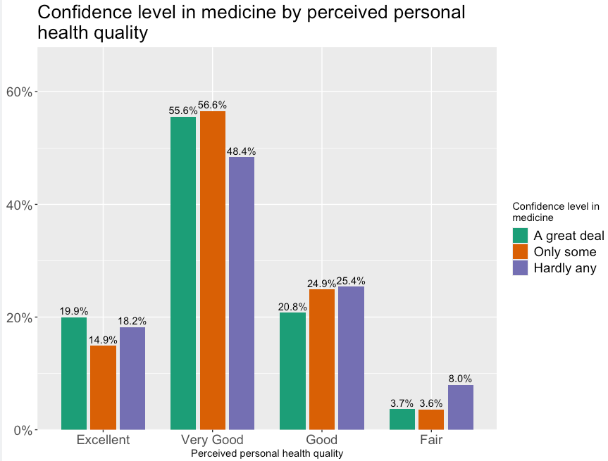
Stacked bar graph by groups interpretation sample
Of the GSS respondents, 18.2% of those who perceive their health as excellent, 48.4% of those who perceive their health as very good, 25.4% of those who perceive their health as good, and 8% of those who perceive their health as fair have hardly any confidence in medicine.
-
Stacked bar graph by groups interpretation template
Of the GSS respondents, xx.xx% of those who are / have / feel / perceive / think / say / report [[value label]] 1 of the [[factor variable]], xx.xx% of those who are / have / feel / perceive / think / say / report value label 2 of the factor variable, and xx.xx% of those who are / have / feel / perceive / think / say / report value label 3 of the factor variable...are / have / feel / perceive / think / say / report selected value label of the [[outcome variable]].
-
Interpretation explanation
- When interpreting stacked bar graphs by groups, we pick one value label of the outcome variable, use the percentage shown on the graph, and compare it across all factor variable value labels.
- In this example, we interpret the "hardly any" value label (purple).
- Then, we report the percentage for the same value label of the outcome variable in value label of the factor variable by tweaking wording to make it understandable. That's why we always read the [[question wording]] first.
- For example: "18.2% of those who perceive their health as excellent have hardly any confidence in medicine..."
- When interpreting stacked bar graphs by groups, we pick one value label of the outcome variable, use the percentage shown on the graph, and compare it across all factor variable value labels.